Components
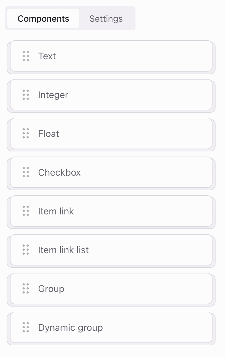
Components are used to customize templates, which then generate form elements such as inputs, selects, and checkboxes for various data collection needs.
Key settings
Every component in a template has some standard settings which control how it works and appears in forms:
- Label: The text displayed above the field in the form, instructs users on what information to input.
- Name: A unique identifier for each component within the template, which becomes the key in the JSON output during data export.
These settings are universally applicable, but some components may have extra settings, depending on their purpose and type.
Text
The Text component is used for inputting text data, perfect for details such as character names, item descriptions, and more.
Settings
- Required: Determines if a field is mandatory to complete the form.
- Max length: Sets the upper characters limit for the text that can be entered.
- Min length: Sets the lower characters limit for the text that can be entered. No limit if empty.
Example
Assume we have next field:
- Label: Character description
- Name: character_description
- Required: No
- Max length: 100
- Min length: 10
Template field with example settings:
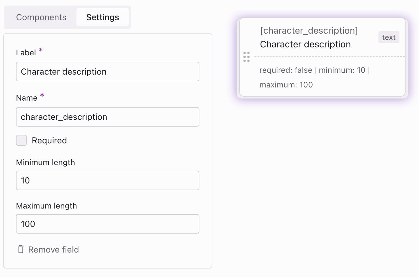
These settings configure the next form field:
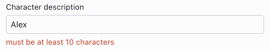
If the input fails to meet the defined settings, such as a minimum length of 10 characters, a validation error will appear. For instance, if a user attempts to input ‘Alex’, they will be unable to save the form until the error is resolved.
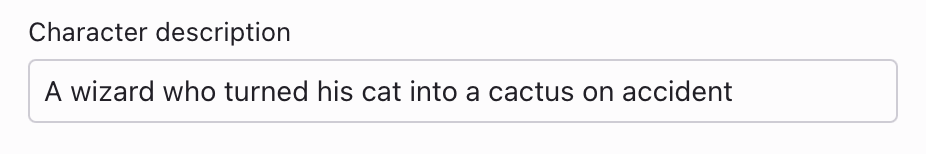
After the form is submitted, the data can be exported in JSON format
{ "character_description": "A wizard who turned cat into a cactus on accident"}Integer
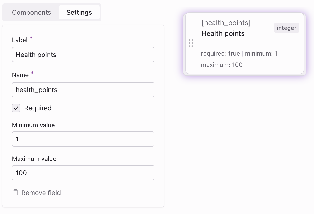
The Integer component is used for entering numbers, ideal for values like player levels, health points, and more.
Settings
- Required: Determines if a field is mandatory to complete the form.
- Max value: Sets the upper limit for the number that can be entered.
- Min value: Sets the lower limit for the number that can be entered. No limit if empty.
Example
Assume we have next field:
- Label: Health points
- Name: health_points
- Required: Yes
- Max value: 100
- Min value: 1
Template field with example settings:
These settings configure the next form field:
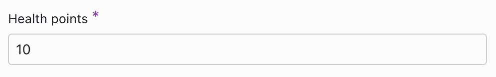
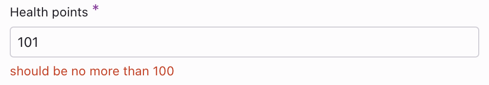
If the entered input doesn’t follow the specified settings - for example, if the allowed range for “maximum lives” is 1-100 and a user enters ‘0’ or ‘101’ - a validation error will occur. The form can’t be saved until the input is corrected to fit within the allowed range.
After the form is submitted, the data can be exported in JSON format
{ "health_points": 10}Float
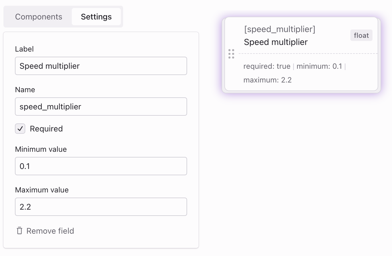
The Float component is used for entering decimal numbers, making it perfect for precise values such as damage modifiers, speed adjustments, and more.
Settings
- Required: Determines if a field is mandatory to complete the form.
- Max value: Sets the upper limit for the number that can be entered.
- Min value: Sets the lower limit for the number that can be entered. No limit if empty.
Example
Assume we have next field:
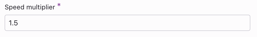
- Label: Speed multiplier
- Name: speed_multiplier
- Required: Yes
- Max value: 2.2
- Min value: 0.1
Template field with example settings:
These settings configure the next form field:
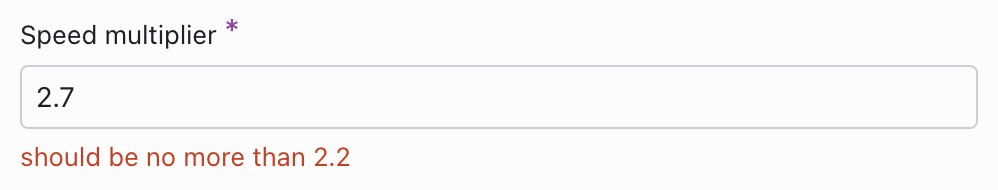
If the entered input does not align with the specified settings—for example, if the valid range for the ‘Speed multiplier’ is 0.1 to 2.2 and a user enters ‘0.05’ or ‘2.7’ — a validation error will display. The form cannot be saved until the input is adjusted to fall within the valid range.
After the form is submitted, the data can be exported in JSON format
{ "speed_multiplier": 1.5}Checkbox
The Checkbox component is used for enabling or disabling features, perfect for binary decisions such as character customization options, activating special abilities in games, and more.
Example
Assume we have next field:
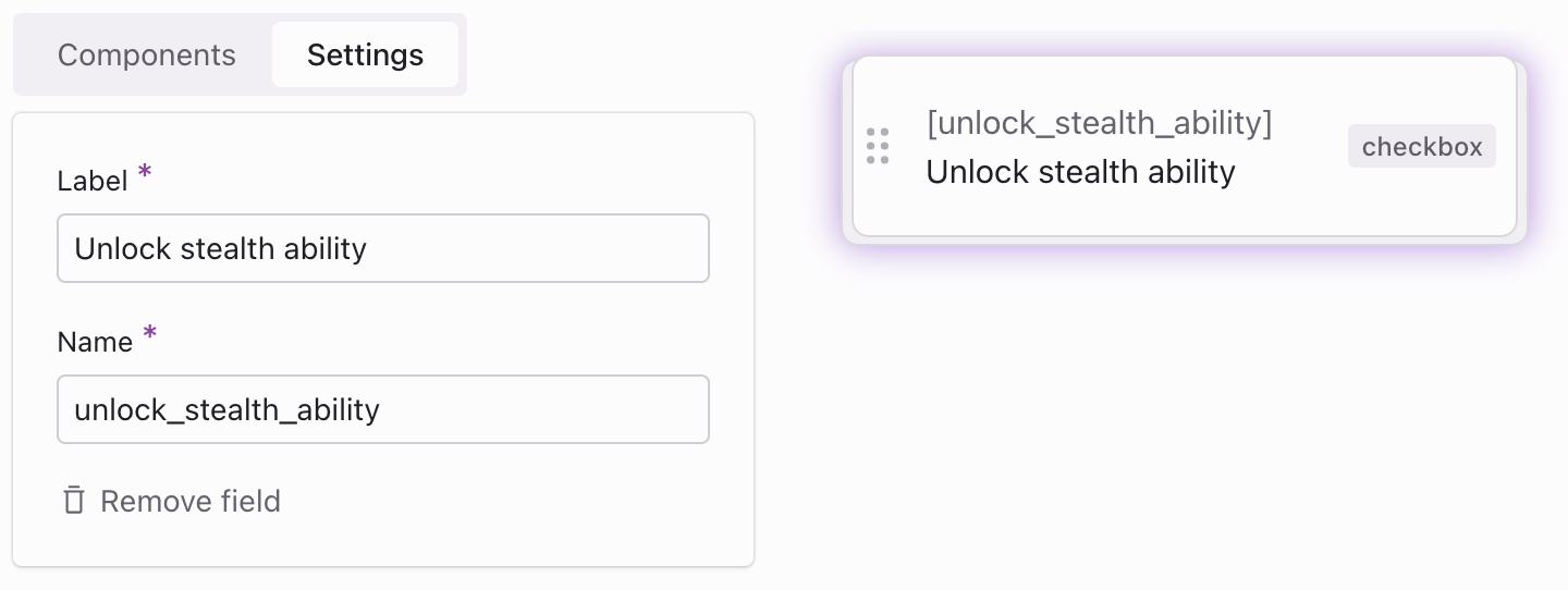
- Label: Unlock stealth ability
- Name: unlock_stealth_ability
Template field with example settings:
These settings configure the next form field:

After the form is submitted, the data can be exported in JSON format
{ "unlock_stealth_ability": true}Item link
The Item link component allows you to select and link a single item, such as a character or level, that you’ve created.
Settings
- Required: Determines if a field is mandatory to complete the form.
- Template: Selects which template to use, determining the items that will be listed in the dropdown menu for selection.
Example
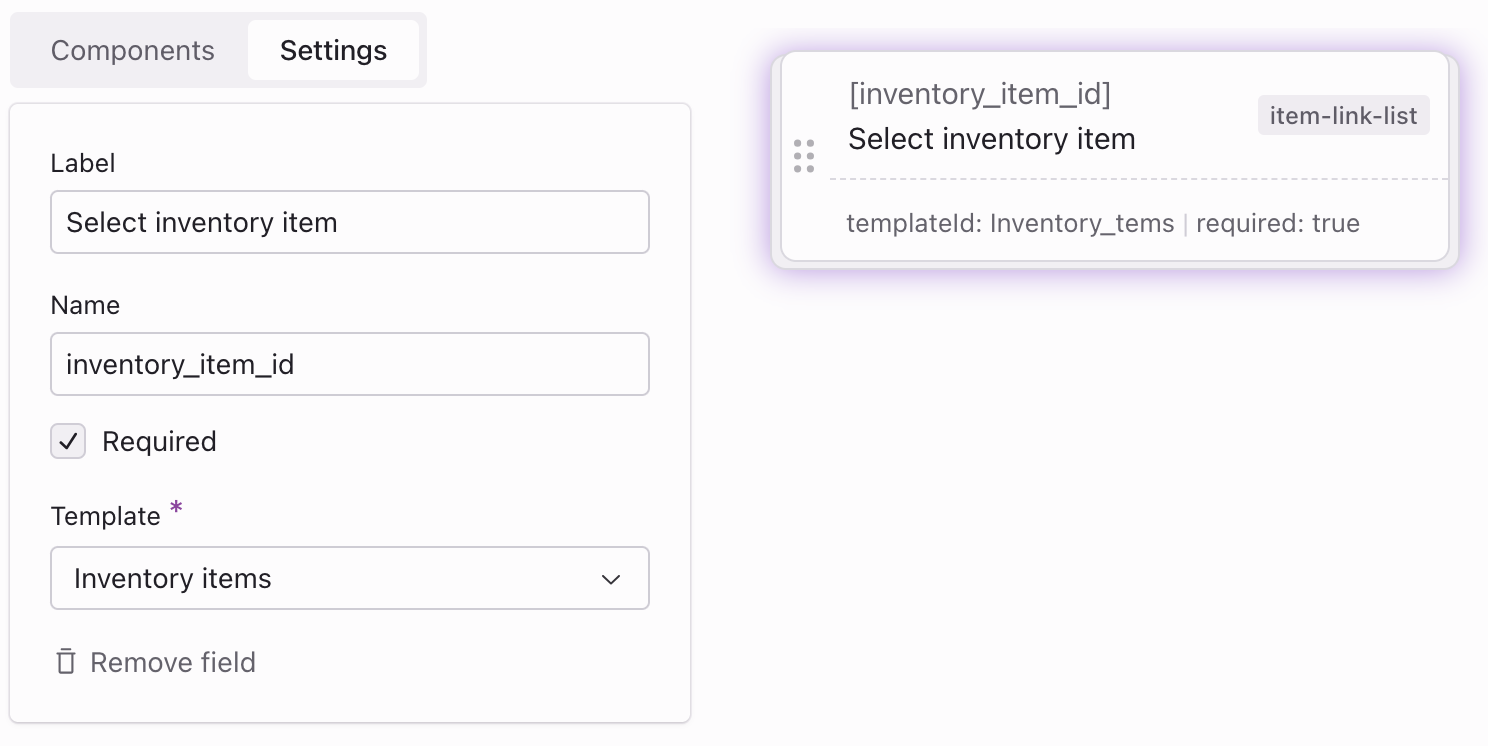
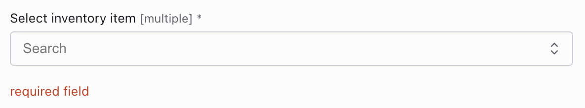
Assume we have next field:
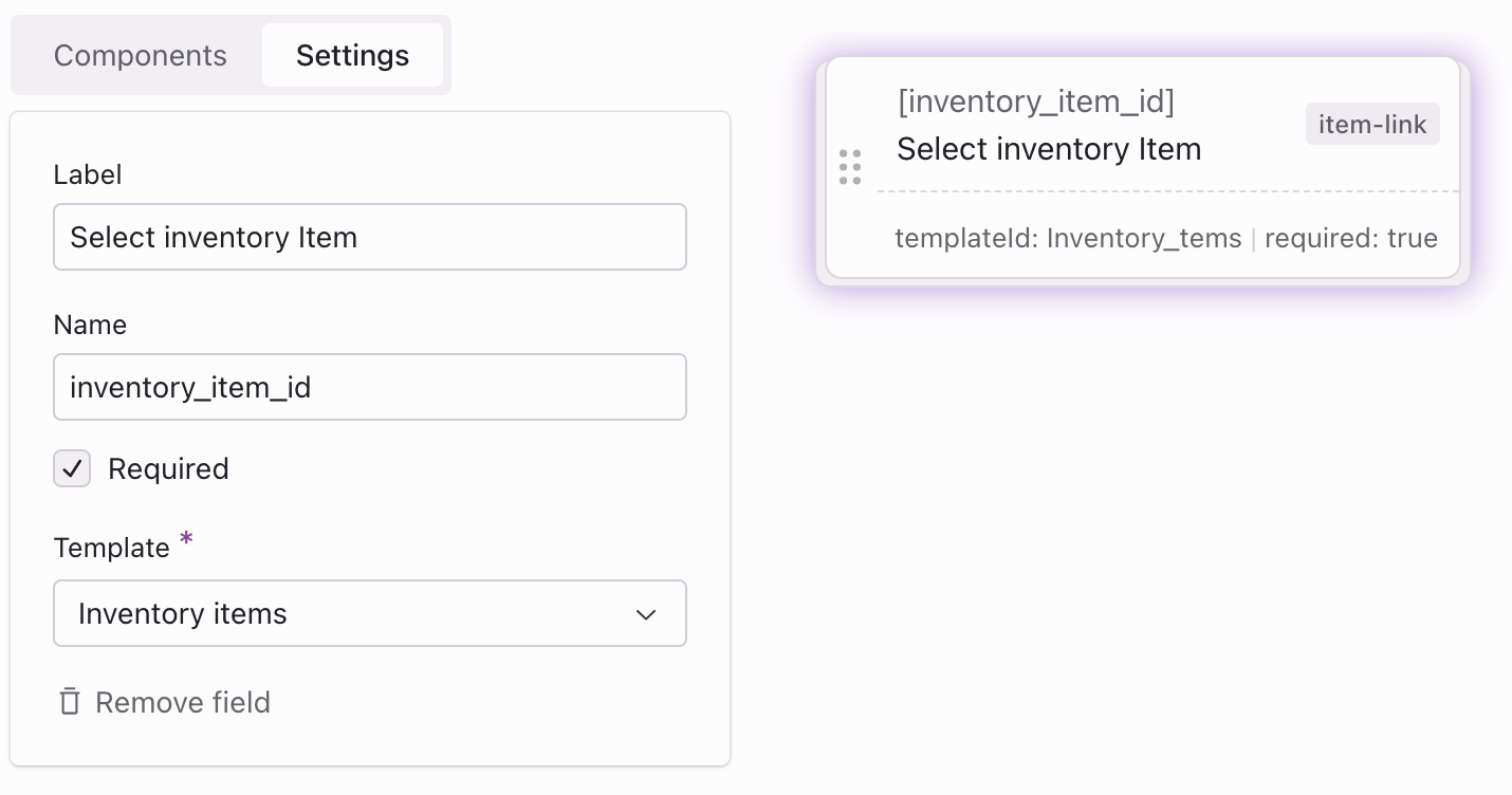
- Label: Select inventory item
- Name: inventory_item_id
- Required: Yes
- Template: Inventory items
Template field with example settings:
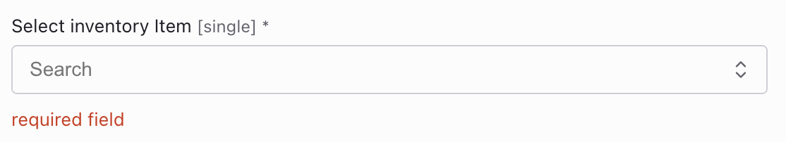
These settings configure the next form field:
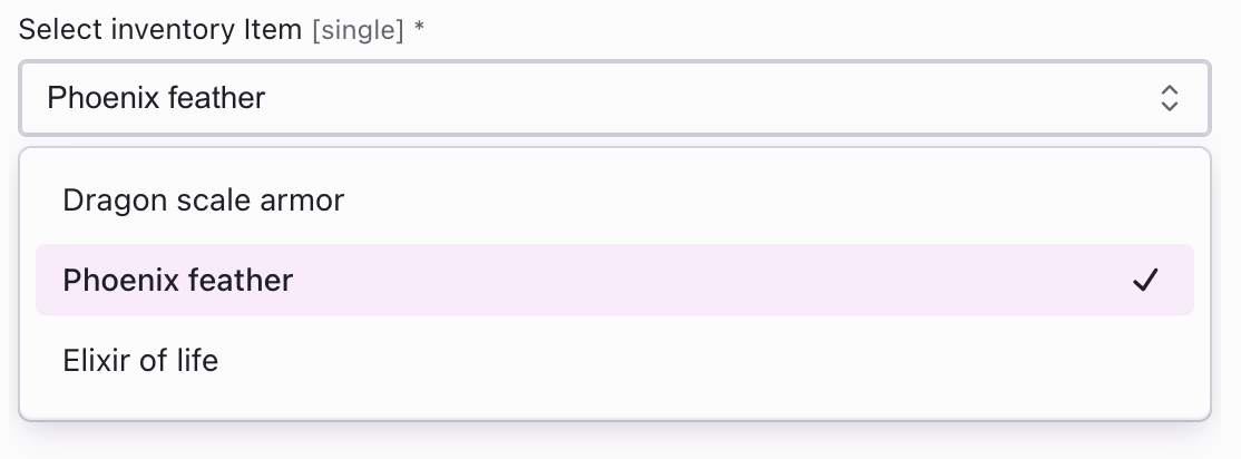
If a selection is not made in a mandatory ‘Item link’ dropdown, a validation error is triggered. The form can only be saved once an item is chosen.
After the form is submitted, the data can be exported in JSON format
{ "inventory_item_id": 2 // item id of Phoenix feather}Item link list
The Item link list component allows you to select and link multiple items, such as a character or level, that you’ve created.
Settings
- Required: Determines if a field is mandatory to complete the form.
- Template: Selects which template to use, determining the items that will be listed in the dropdown menu for selection.
Example
Assume we have next field:
- Label: Select inventory item
- Name: inventory_item_id
- Required: Yes
- Template: Inventory items
Template field with example settings:
These settings configure the next form field:
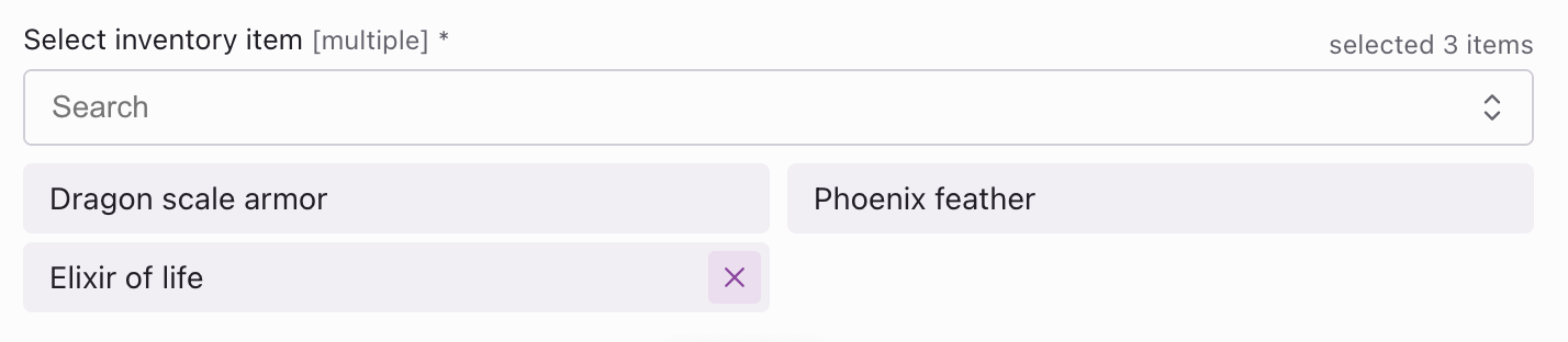
If a selection is not made in a mandatory ‘Item link list’ dropdown, a validation error is triggered. The form can only be saved once an item is chosen.
After the form is submitted, the data can be exported in JSON format
{ "inventory_item_id": [2, 5, 7] // array of selected item IDs}Group
The Group component organises related form fields into one category. It creates nested data structures in JSON, letting users group similar inputs, like names or ages, under one heading.
Example
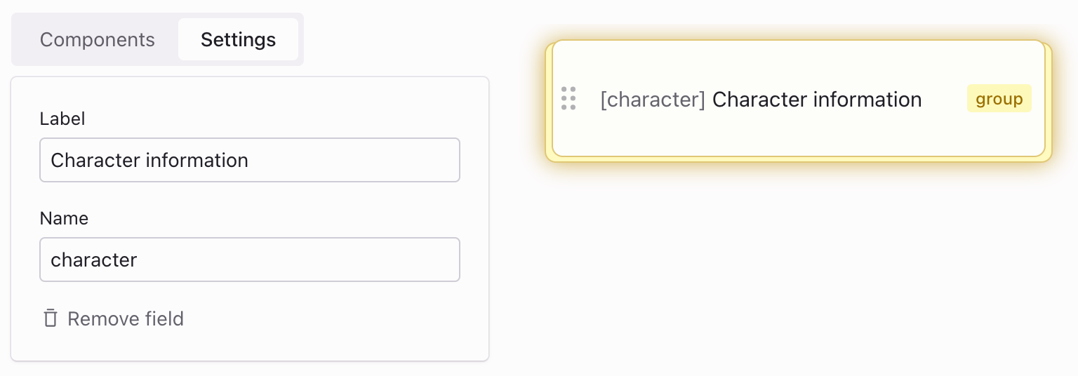
Assume we have next field:
- Label: Character information
- Name: character
Template field with example settings:
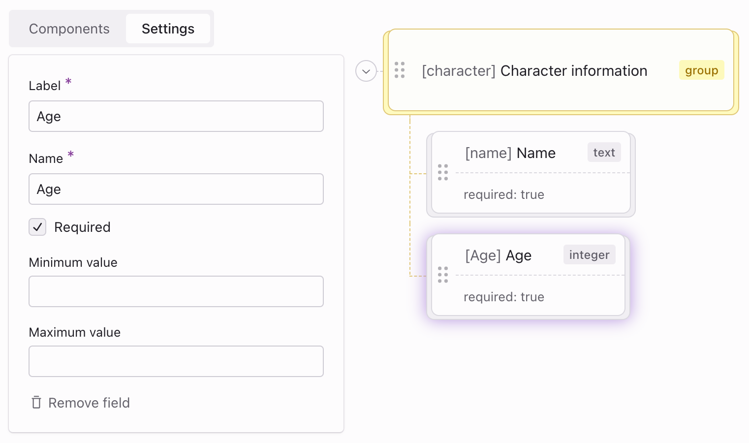
Within the “Character Information” group, you might add the following nested components:
- Text component for “Name”:
- Label: “Name”
- Name: “name”
- Required: Yes
- Number component for “Age”:
- Label: “Age”
- Name: “age”
- Required: Yes
These settings configure the next form field:
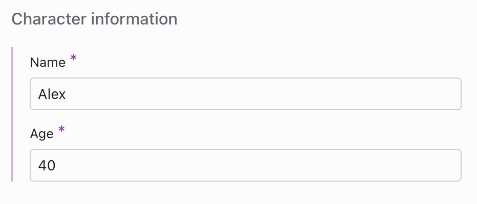
After the form is submitted, the data can be exported in JSON format
{ "character": { "name": "Alex", "age": 40 }}Dynamic group
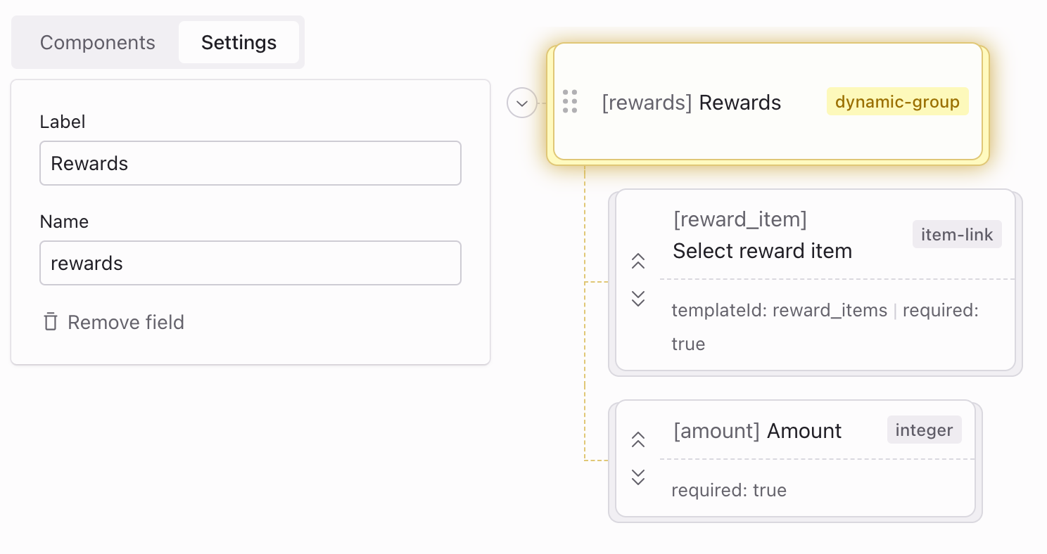
The Dynamic group component lets users add and control multiple sets of predefined fields in a form. It’s useful when users need to input varying quantities of similar items, like managing in-game rewards or inventory.
Example
Consider a scenario in a game where you need to allow game designers to specify multiple rewards that players can earn in a level:
- Label: Rewards
- Name: rewards
For each “Reward” instance, the following fields might be included:
- Item link (to select the reward type):
- Label: “Select reward item”
- Name: “reward”
- Template: “Game rewards”
- Integer (to specify the quantity of the reward):
- Label: “Amount”
- Name: “amount”
Template field with example settings:
Example in-game rewards might look like this:
- Steel axe: 1
- Golden ingot: 2
These settings configure the next form field:
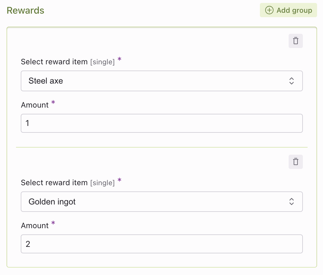
After the form is submitted, the data can be exported in JSON format
{ "rewards": [ { "reward_item": 4, // axe item id "amount": 1 }, { "reward_item": 5, // ingot item id "amount": 2 }, ]}